The Merchant of Venice
Art Direction
This poster held significant importance for me, especially considering my limited budget. Over the course of a couple of months during the summer, I dedicated my time to understanding the theatre's winter needs, albeit with guidelines that I knew I would soon modify. When designing this poster, I made the conscious decision to redistribute the visual weight, shifting it away from the centrality of the roundel in the logo to emphasize the image instead. I didn’t want to take excessive risks, as I needed the organization's approval for my decision. Ultimately, this adjustment felt like a very reasonable compromise.![]()
Art Direction
This poster held significant importance for me, especially considering my limited budget. Over the course of a couple of months during the summer, I dedicated my time to understanding the theatre's winter needs, albeit with guidelines that I knew I would soon modify. When designing this poster, I made the conscious decision to redistribute the visual weight, shifting it away from the centrality of the roundel in the logo to emphasize the image instead. I didn’t want to take excessive risks, as I needed the organization's approval for my decision. Ultimately, this adjustment felt like a very reasonable compromise.


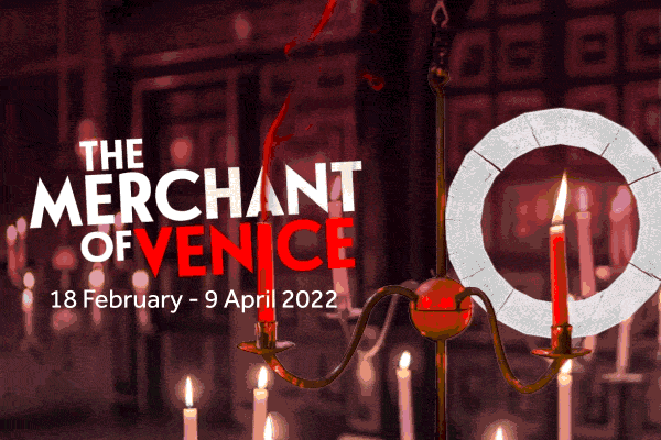
︎︎︎In the initial stages of crafting the image, I experimented extensively with both still as well as dynamic elements, exploring various approaches for digital marketing.
 The original image has an incredible space around it.
 Extreme bleed was incredibly effective for this artwork.