The Tempest2023
︎ Kate Bones
The Tempest, photographed by Kate Bones, represented one of the first steps towards the reintroduction of a more extensive use of color by Shakespeare’s Globe. Previously confined to a black, red, and white color palette, this production signaled a departure into richer and more vibrant hues.
It’s my job to check what other people did before me for posters that carry big titles like this one... and speaking with the director of the play, the unconventional Sean Holmes, I decided that the title “The Tempest” was already giving away quite a lot... So I decided not to splash any water in it, and go very opposite. The play would have been in the summer (british summer but still...) and I wanted to be as catchy as possible to help the Theatre after two very long years of pandemic.
![]()
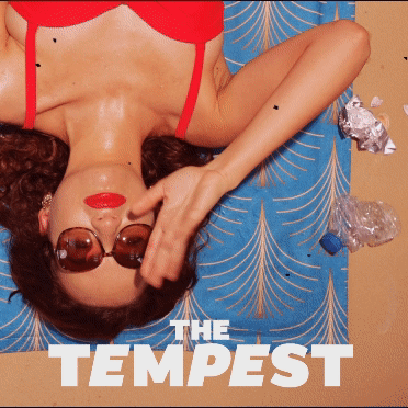
︎ Kate Bones
The Tempest, photographed by Kate Bones, represented one of the first steps towards the reintroduction of a more extensive use of color by Shakespeare’s Globe. Previously confined to a black, red, and white color palette, this production signaled a departure into richer and more vibrant hues.
It’s my job to check what other people did before me for posters that carry big titles like this one... and speaking with the director of the play, the unconventional Sean Holmes, I decided that the title “The Tempest” was already giving away quite a lot... So I decided not to splash any water in it, and go very opposite. The play would have been in the summer (british summer but still...) and I wanted to be as catchy as possible to help the Theatre after two very long years of pandemic.
︎︎︎Bringing images to life, meeting the demand to extend beyond the stillness of posters.


︎︎︎Drawing inspiration from the First Folio, our title treatment takes a tilt, a theme carried through the entire season's designs.

︎︎︎I worked on these two posters in the same week and for the same theatre season and I really like how they juxtapose. Check out process for I,JOAN